 Claude
  Perplexity
A Guide on How to Lower Bounce Rate
Learn how to lower bounce rate with proven strategies. Our guide covers site speed, UX, and mobile design to keep visitors engaged and boost your SEO.
TL;DR: Learn how to lower bounce rate with proven strategies. Our guide covers site speed, UX, and mobile design to keep visitors engaged and boost your SEO.
If you want to lower your bounce rate, you first need to play detective. Figure out why visitors are leaving your site so quickly, and only then can you roll out the right fixes. This usually comes down to improving your site’s page speed, mobile experience, and content relevance so you can meet—and exceed—user expectations.
Why Visitors Leave Your Website So Quickly
A high bounce rate can feel like a silent rejection. Someone lands on your page, takes a quick look, and then hits the “back” button without clicking a single thing. It’s frustrating. But before you can effectively lower your bounce rate, it’s crucial to understand that not all bounces are inherently bad. This metric really just tells a story about your visitor’s intent and how satisfied they were.
Sometimes, a bounce is actually a win. Imagine someone searching for a specific answer, landing on your blog post, finding exactly what they need in the first paragraph, and leaving happy. Mission accomplished for them. More often than not, though, a high bounce rate is a red flag, pointing to underlying issues that are turning users away and hurting your site’s overall performance.
The Most Common Culprits
From my experience, a few usual suspects are responsible for most premature exits. Pinpointing which of these are plaguing your site is the first real step toward a fix.
Here’s what I see most often:
- Painfully Slow Load Times: In a world of instant gratification, a page that takes more than a few seconds to load is a dealbreaker. Most people just won’t wait.
- Poor Mobile Experience: If your site is a mess on a smartphone—think tiny text, buttons you can’t tap, or clunky layouts—you’re practically begging mobile users to leave.
- Misleading Title or Description: This is a classic bait-and-switch. When your page content doesn’t match what you promised in the search results, visitors feel tricked and bounce immediately.
- A Wall of Text: Nothing sends people running faster than a huge, dense block of text. Without clear headings, plenty of white space, and maybe an image or two, it’s just too intimidating to read.
A bounce rate isn’t just a number; it’s a direct reflection of your user experience. It signals a disconnect between what a visitor expected and what they actually found on your page.
This visual breakdown offers some solid benchmarks, showing the gap between an average site’s performance and where you should be aiming.
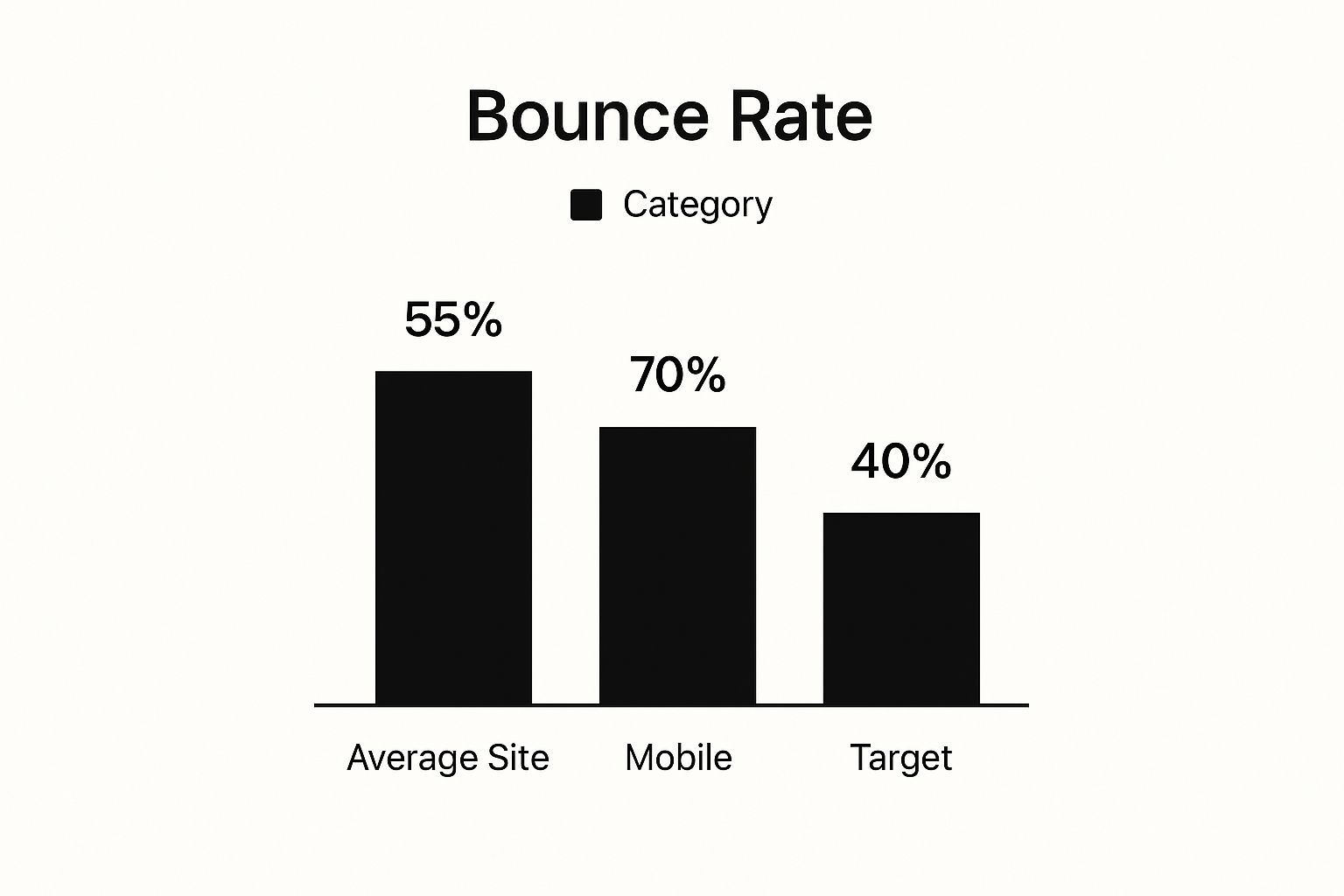
That jump between the average site bounce rate and the mobile-specific one? It’s a stark reminder that if you aren’t optimizing for mobile first, you’re already behind.
Setting Realistic Benchmarks
What’s a “good” bounce rate, anyway? Well, it really depends on your website’s purpose. Context is everything. To set realistic goals, it helps to see how your site stacks up against others with similar user goals.
Average Bounce Rate by Website Type
| Website Type | Typical Bounce Rate Range | Common User Intent |
|---|---|---|
| B2B / SaaS | 25% - 55% | Researching solutions, comparing features, requesting a demo. |
| eCommerce / Retail | 20% - 45% | Browsing products, making a purchase, checking order status. |
| Blog / Content | 65% - 90% | Finding a quick answer, reading a single article, getting information. |
| Lead Generation | 30% - 50% | Filling out a form, downloading a resource, signing up for a service. |
| Landing Pages | 60% - 90% | Single action: sign up, download, or purchase immediately. |
As you can see, a blog can have a bounce rate above 65% and be perfectly healthy, since visitors often just read one article and leave. On the other hand, a B2B site with that same rate would have a serious problem, as its users are expected to dig deeper. For a closer look at industry averages, you can explore the latest data on website bounce rates at https://truelist.io/blog/acceptable-email-bounce-rate.
And while this article is focused on website visitors, it’s interesting to see the parallels with email marketing. Understanding what an acceptable email bounce rate looks like gives you a more complete picture of how your audience engages across different channels.
If you’re ready to dive in and start making changes, there are many excellent resources out there with proven strategies to reduce bounce rate and keep your hard-earned visitors engaged.
Boost Page Speed to Keep Users from Bouncing

Let’s be honest: slow-loading pages are a massive, and completely avoidable, reason people bounce. In a world where we expect everything instantly, even a few seconds of delay can send your bounce rate through the roof. Most visitors will just give up and leave before your content even has a chance to load.
Thinking about site speed isn’t just some technical box-ticking exercise; it’s fundamental to creating a good user experience.
The first thing you need to do is get a baseline. You can’t improve what you don’t measure. I always start with free tools like Google PageSpeed Insights. It gives you a clear picture of how your site performs on both mobile and desktop, but more importantly, it spits out a prioritized list of exactly what you need to fix. That report is your roadmap.
For example, a common flag I see on client reports is “oversized images.” This just means your beautiful, high-resolution photos are dragging the whole page down. It’s one of the easiest and most impactful things to fix.
Quick Wins for a Faster Website
Once you have that diagnostic report, you can start making some changes. The good news is that many of the most effective fixes are surprisingly simple and don’t require you to rebuild your entire website.
Here are a few high-impact areas I always recommend tackling first:
- Compress Your Images: Large image files are almost always the biggest culprits for slow load times. Use a tool like TinyPNG or an optimization plugin to shrink those file sizes way down without any noticeable drop in quality. This one step can literally shave seconds off your load time.
- Leverage Browser Caching: Caching is a clever way to store parts of your site (like your logo or stylesheet) in a visitor’s browser. When they come back, the site loads almost instantly because their browser doesn’t have to download all those assets again.
- Minify Your Code: Think of minification as spring cleaning for your website’s code (CSS, JavaScript, HTML). It removes all the unnecessary characters—like spaces and comments—making the files lighter and faster for a browser to read and process.
Slow speed is a silent conversion killer. Research consistently shows that nearly 70% of consumers admit they’re less likely to buy from a brand if they have a negative experience with a slow website.
Advanced Speed Optimization Techniques
After you’ve handled the basics, it’s time to look at some more advanced strategies. These can offer huge performance gains, especially if you have a global audience or a more complex website.
One of the most powerful tools in your arsenal is a Content Delivery Network (CDN). A CDN is just a network of servers spread all over the world. It works by storing copies of your site’s static content—like images and scripts—and delivering them to visitors from the server that’s physically closest to them.
So, if your main server is in Dallas, a visitor from London won’t have to wait for the data to travel across the Atlantic. Instead, they’ll get it from a server right there in the UK. This massively cuts down on latency and makes a world of difference for your international users.
Finally, don’t forget to review your hosting plan. If your site has grown over time, that cheap, shared hosting plan you started with might now be the bottleneck. Upgrading to a better hosting solution gives your site more resources and a faster foundation to build on. It’s a critical investment if you’re serious about lowering your bounce rate.
Write Content That Actually Keeps People on the Page

Once your site is loading quickly, the next big battleground for lowering your bounce rate is your content. Think about it: if someone lands on your page and doesn’t immediately see what they came for, they’re clicking that back button. It’s that simple.
A fantastic approach here is the inverted pyramid model, a trick we’ve borrowed straight from journalism. You lead with the most important stuff—the answer, the key takeaway, the main point—right at the very top. This gives the reader instant gratification and builds enough trust to make them stick around for the details.
Make Your Content Easy to Scan
Let’s be honest, people don’t read online; they scan. A giant wall of text is an instant turn-off and practically begs visitors to bounce. You have to break things down into bite-sized, visually appealing pieces.
Here are a few ways I’ve found to make content much easier to digest:
- Subheadings are your best friend: Use clear, descriptive H3s and H4s. They act like signposts, helping readers jump to the sections that matter most to them.
- Keep your paragraphs short: Aim for one to three sentences max. This creates white space, making the whole page feel less intimidating and much more inviting.
- Use bullet points: Lists are perfect for breaking down features, steps, or benefits into a format that’s incredibly easy to scan and remember.
Beyond just the formatting, the actual quality of your writing is what will ultimately keep visitors locked in. If you want to go deeper on this, there are great resources that can help you master your website content strategy.
Bring Your Content to Life with Media
Text on its own is rarely enough to capture and hold someone’s attention these days. Sprinkling in different types of media is a surefire way to make your content more engaging and slash that bounce rate. We’re talking high-quality images, custom infographics, and especially video.
The proof is in the data. When you look at the world’s biggest websites, the ones built around video have a serious edge.
Take YouTube, the second most visited site in the world. Its bounce rate is just 34.29%. Compare that to Google’s 43.44%. It’s a clear signal that content designed for active viewing keeps people on a site for much longer.
A well-placed video can break down a complicated subject in minutes, demonstrate how a product works, or just give your brand a more human feel. These aren’t just decorations; they give visitors compelling reasons to interact and stay put.
Interestingly, these same principles for engagement apply across different channels. Learning to create compelling web content can also help you increase your email open rates by keeping your audience hooked.
Improve Your Site Navigation and User Journey
A confusing website is a bounce rate magnet. If visitors can’t easily find what they’re looking for, they won’t stick around to figure it out. They’ll just leave. That’s why one of the most effective ways to lower your bounce rate is to create an intuitive, frictionless user journey.
Think of your site’s navigation as the map you hand every visitor. If that map is torn, mislabeled, or just plain hard to read, they’ll get lost and frustrated. Your goal is to provide a crystal-clear path that guides them exactly where they want to go—and maybe even helps them discover a few interesting spots they didn’t know they were looking for.
The secret to a great user journey is making the next step obvious and appealing. When someone finishes reading a blog post, what do you want them to do? Don’t leave them at a dead end. Instead, nudge them toward another relevant article, a related product page, or a valuable resource.
Build a Logical Navigation Menu
Your main navigation menu is the first tool most visitors will use to explore. It needs to be simple, predictable, and right where people expect it—usually across the top of the page. Steer clear of vague labels like “Resources” or “Solutions.” Be specific. Use clear, descriptive terms that tell people exactly what they’re getting into.
A marketing agency, for instance, should opt for clarity:
- Use SEO Services instead of “What We Do”
- Use Case Studies instead of “Our Work”
- Use Blog instead of “Insights”
This simple change removes all the guesswork and helps visitors get their bearings immediately. A well-structured menu cuts down on frustration and encourages people to click around, which is exactly what you want.
A well-planned user journey doesn’t just lower your bounce rate; it fundamentally changes user behavior. By guiding visitors from one page to the next, you increase their investment in your site and brand.
This connection isn’t just a theory; the data backs it up. An analysis of website statistics shows a strong inverse relationship between bounce rate and pages per visit. The sites with the lowest bounce rates typically had visitors engaging with 7 to 8 pages, while high-bounce-rate sites only saw 1 or 2 pages per visit. You can dig into more of these website statistics at Reboot Online.
Use Strategic Internal Linking
Beyond the main menu, internal links are your secret weapon for guiding the user journey. Think of them as helpful signposts woven directly into your content. Whenever you mention a related concept or product, link to the page with more detail.
This practice is powerful for two reasons:
- It keeps users engaged. By offering a logical next step, you make it easy for them to keep exploring topics they’re already interested in.
- It boosts your SEO. Internal links help search engines map out your site’s structure and understand how your pages relate to one another.
For example, if someone is reading your article on “improving email open rates,” a link to a guide on “writing better subject lines” is a perfectly natural and helpful next step.
Finally, don’t forget about your site search. For visitors who know exactly what they want, a prominent and effective search bar is their best friend. Make sure it’s easy to find and delivers accurate, relevant results. Nothing sends a user packing faster than a useless search function.
Prioritize a Mobile-First Design for How We Browse Today

Let’s be honest, how are you reading this right now? Chances are, it’s on a phone. The reality is that mobile traffic now makes up almost 60% of all web traffic across the globe.
This isn’t just a trend; it’s the standard. If your website forces someone to pinch, zoom, and struggle to tap a tiny button, they’re gone. A frustrating mobile experience is one of the quickest ways to send your bounce rate through the roof.
Thinking “mobile-first” isn’t just about making your desktop site smaller. It’s a fundamental shift in strategy. You have to design the experience for the smallest screen first, focusing on what’s absolutely essential, and then scale up from there. This approach naturally leads to a cleaner, faster, and more focused user experience for everyone.
Of course, the technical foundation for this is responsive design. A responsive site fluidly adapts its layout to fit any screen, from a widescreen monitor to the phone in your pocket. Truly understanding why responsive design is important is the first step, as it ensures a consistent, user-friendly experience no matter the device.
Make Your Mobile Experience Effortless
When you’re designing for a mobile screen, every element matters. The goal is to get rid of any friction that might slow a user down or cause them to second-guess what to do next. Speed is even more critical here, as people are often on less-than-perfect cellular connections.
To craft an experience that actually keeps people around, zero in on these areas:
- Make Buttons and Links Easy to Tap: Every interactive element needs to be large enough for a thumb to tap easily without hitting something else by mistake. This sounds basic, but it’s a massive source of user frustration.
- Keep Your Fonts Readable: No one should have to zoom in to read your content. Pick clean fonts and make sure the contrast with the background is strong enough for easy reading in different lighting conditions.
- Simplify Everything: A complex navigation menu that works on a desktop is a usability nightmare on a phone. Strip it down to the essentials. The same goes for forms—only ask for what you absolutely need. Typing on a small keyboard is a pain, so keep it brief.
A poor mobile experience does more than just annoy a visitor. It tells over half your audience that their time isn’t important to you. If your site isn’t built for their device, you’re essentially showing them the door.
Practical Tips for Optimizing Your Mobile Site
Going beyond just the basics of a responsive layout can make a huge difference. You have to think about the user’s context. They could be walking down the street, multitasking, or trying to find information in a hurry. Your site needs to accommodate that reality.
Here are a few experienced-based tips that really work:
- Use the Right Keyboard: When a user taps a form field, the right keyboard should automatically appear. Tapping the “phone number” field should bring up the number pad. For an email field, the keyboard should have the ”@” and ”.” symbols readily available. It’s a small detail that makes a world of difference.
- Aggressively Optimize Images: Image optimization is always important, but it’s non-negotiable for mobile. Use modern, lightweight formats like WebP, and compress every single image. Fast loading times on mobile are a must.
- Rethink Your Popups: A popup that’s mildly annoying on a desktop can completely block the view on a mobile screen and be incredibly difficult to close. If you absolutely must use them, make sure they are designed specifically for mobile and have a clear, easy-to-tap exit button.
By making these kinds of thoughtful, user-centric adjustments, you’re not just lowering your bounce rate. You’re building a site that people actually enjoy using, encouraging them to stay, explore, and convert.
Even after you’ve put a solid plan in motion, it’s completely normal to have questions crop up about your bounce rate. It can feel like a pretty abstract metric, so let’s walk through some of the most common uncertainties I see and get you some direct, practical answers.
Getting a handle on these fundamentals is key. It helps you set realistic expectations and, more importantly, focus your energy where it will actually make a difference. People often get hung up on a single number, but the real story is always more nuanced. The context behind your bounce rate is just as important as the number itself.
What Is a Good Bounce Rate?
Honestly, there’s no magic number here. What’s considered a “good” bounce rate is completely tied to your industry and the specific goal of the page.
For a blog post or a news article, it’s not unusual to see a bounce rate somewhere between 65% and 90%. Think about it: a visitor lands, gets the exact information they were looking for, and leaves. That’s a successful visit, not a failure.
On the other hand, an e-commerce or service site should be aiming much, much lower—ideally in the 25% to 45% range. For these sites, a low bounce rate means visitors are sticking around, browsing multiple products, and digging deeper into what you offer. That’s the kind of engagement that leads to sales. Your best bet is to measure your performance against your industry’s average and, even more critically, your own historical data.
A “good” bounce rate is a moving target defined by user intent. Success for a blog is a visitor finding a quick answer and leaving, while success for an e-commerce site is a visitor staying to browse multiple products.
How Long Does It Take to Lower Bounce Rate?
The time it takes to see a change really depends on what you’re fixing. Some changes show results almost immediately, while others are more of a slow burn.
Technical Changes (Fast Results): If you’re improving page speed, fixing a clunky mobile design, or repairing broken links, you can see results pretty quickly. It’s possible to notice a drop in your bounce rate within just a few days to a couple of weeks as Google re-crawls your site and your analytics platform starts collecting fresh data.
Content Changes (Slower Burn): Things like overhauling your content strategy, improving internal linking, or creating more engaging videos and graphics take longer. These efforts often need a good 1-3 months to show a significant impact because they rely on attracting new traffic and gradually shifting user behavior over time.
Does Bounce Rate Directly Affect SEO Rankings?
This is a classic debate, and the answer is a little bit of a “yes and no.” Google has been clear that bounce rate is not a direct ranking factor. They don’t just look at that number and decide to move you up or down in the search results.
However—and this is a big however—a consistently high bounce rate is almost always a symptom of poor user experience. And user experience is a huge ranking factor. If users constantly land on your page and immediately click the back button to return to the search results (a behavior often called “pogo-sticking”), that’s a strong signal to Google that your page isn’t giving people what they want. Over time, that indirect signal can absolutely hurt your rankings.
Plus, many of the issues that cause a high bounce rate—like slow load times or a terrible mobile experience—are direct ranking factors in their own right. So while obsessing over the number itself isn’t the most productive use of your time, viewing it as a health check for your site’s user experience and content strategy is a smart move. For a deeper look into related metrics, exploring the essentials of email validation can also offer insights into the quality of your audience engagement.
Ready to stop guessing and start cleaning? With Truelist, you get pay-as-you-go credits that never expire, plus unlimited plans for high-volume senders — with no hidden fees. Ensure your emails reach real inboxes, protect your sender reputation, and boost your campaign performance. Start validating for free today at Truelist and see the difference a clean list makes.